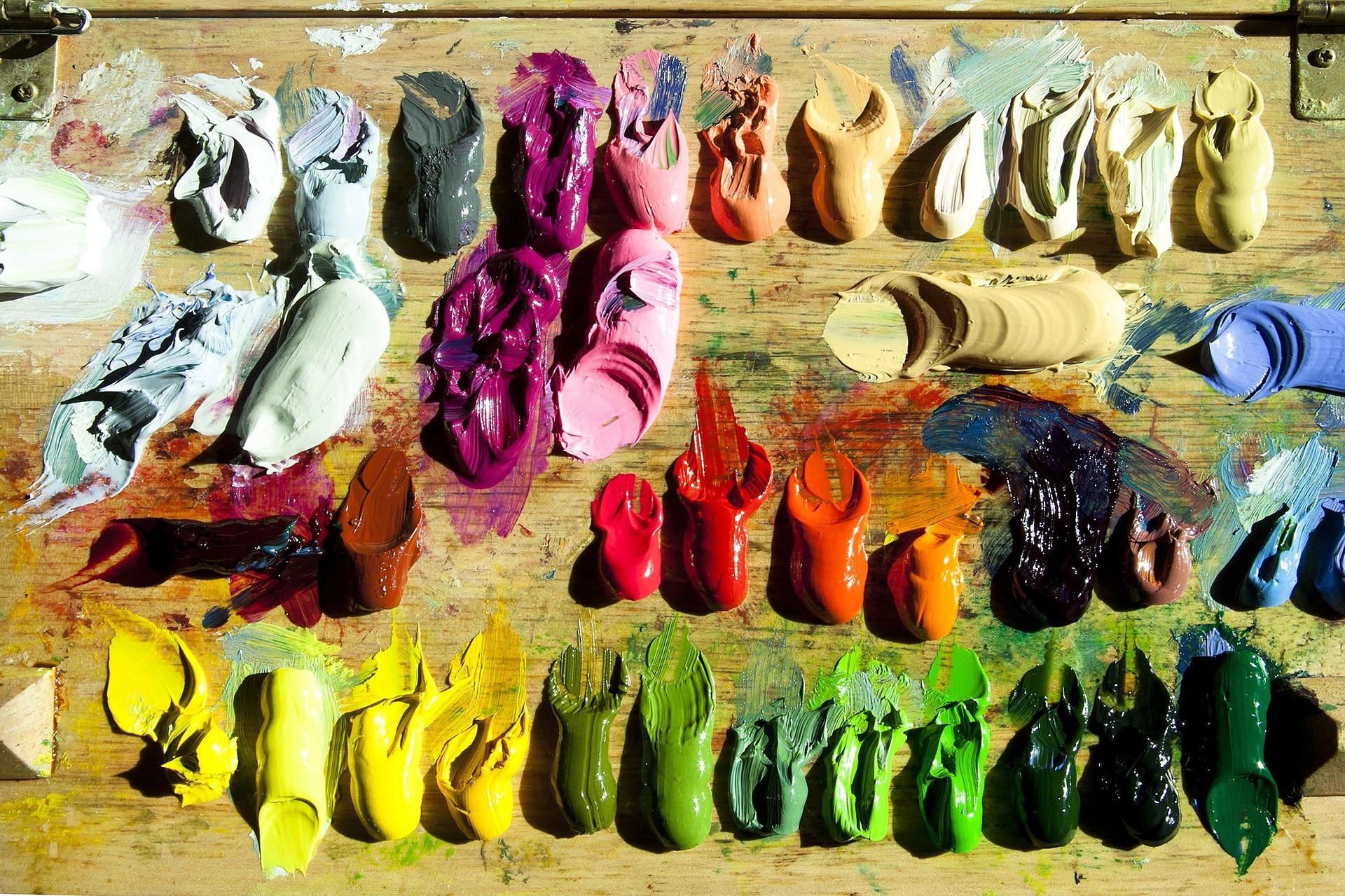
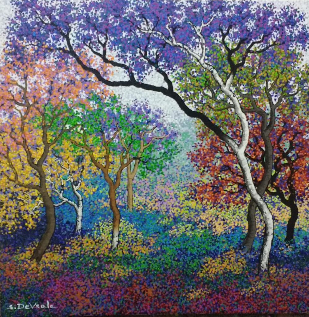
HOW DO THE COLORS SPEAK TO YOU
There isn’t a joy that a box of crayons can bring to a child. Color is a fascinating, unspoken language. It communicates ideas and feelings that words cannot; it speaks to our conscious and subconscious minds. Color shapes our well-being, influences our moods, and can even encourage spiritual growth.
Color is a determinant for human emotion, reaction and behavior. Color can subconsciously influence emotions, and how humans react to things such as taste of food, products, and experiences.
Where do these color meanings come from?
Millions of years of biological conditioning have created certain associations between colors and objects or emotions, while some associations may be more recent. Feelings are much more powerful than rational thoughts based on facts and figures and applying color meanings and color symbolism will make your interiors and ambiences much more effective.
Color meanings stem from psychological effects, biological conditioning and cultural developments. Some color meanings are deeply rooted in our brains because they’re visible all around us, like red as the color of fire being associated with warmth or green with nature. We’re biologically wired to pay attention to bright colors because brightly colored animals or plants are often poisonous. We’re drawn to red fruit over green fruit because the color indicates ripeness and sweetness.
Other colors have developed cultural meaning over time and their meanings have been adopted by society, such as pink as a color for girls and blue for boys in Western cultures (which in the recent times, has gone further ahead, adding many more colors to their respective genders).
Here are a few things that can have an impact on the meaning of colors :
Cultural differences — Black is the color of mourning in Western countries, while in some East Asian countries, like our India, it’s white. Red represents good luck in China but in South Africa it’s the color of mourning. Americans associate green with money as that’s the color of dollar bills but that isn’t the case globally. In the US green is the color of envy, while in Germany it’s yellow. You’ll need to be sensitive to these differences depending on where you are located.
Shades and tones — A color may have a general meaning, but lighter shades can vary dramatically compared to darker shades, while more natural, muted shades will differ from artificial neon colors. Make sure that you look at the specific associations of the different shades and tones. For example, if you’re looking at a neon green, don’t assume that just because you’ve chosen a shade of green it’s going to be a good fit for an eco-friendly resort. Similarly, a bright magenta will have a totally different meaning from a muted pastel shade of rosé, even if they are both shades of pink.
Color Combinations — If you’re looking at more than one color you need to be aware of how color combinations affect the overall meaning. They can enhance each other, make each other pop, blend together or fight with each other. You’ll need to give some thought to their combined meanings and what effect you want to achieve with your combination.
Here are a few general interpretations of colors :

VIOLET / PURPLE
Purple is for luxury, mystery and spirituality
Purple is an interesting color: it’s both warm and cool, combining the passion and energy of red with the calm and serenity of blue. Because of its associations with royalty, purple is inherently prestigious and luxurious. Purple dye was historically expensive, which meant that only wealthy rulers could afford it. The ruling classes and kings and queens of old would wear purple and Queen Elizabeth I even forbade anyone outside of the royal family from wearing it. Purple is also associated with religion and spirituality, since the ancient rulers were thought of as descendants of the gods and the color holds a special meaning in religions including Catholicism, Judaism and Buddhism.
Use purple when you want to evoke those luxurious, royal connections—combine it with gold for that extra ‘wow’. Or use it when you want to add a dash of mysticism and spirituality to your interiors. It looks best with some green for a really striking contrast or with pink to emphasize the feminine.
INDIGO
Indigo is for spiritual wisdom, intuition and introspection
Indigo is a deep midnight blue. It is a combination of deep blue and violet and has the attributes of both colors. Indigo usually represents our deepest thoughts and spiritual wisdom. Indigo blue helps with communication, meditation and peace. The color indigo is the color of intuition and perception and is helpful in opening the third eye. It promotes deep concentration during times of introspection and meditation, helping you achieve deeper levels of consciousness.
Indigo stimulates right brain or creative activity and helps with spatial skills. It is a dramatic color relating to the world of the theatre. It is the perfect color to go in your offices, drawing rooms and study areas.
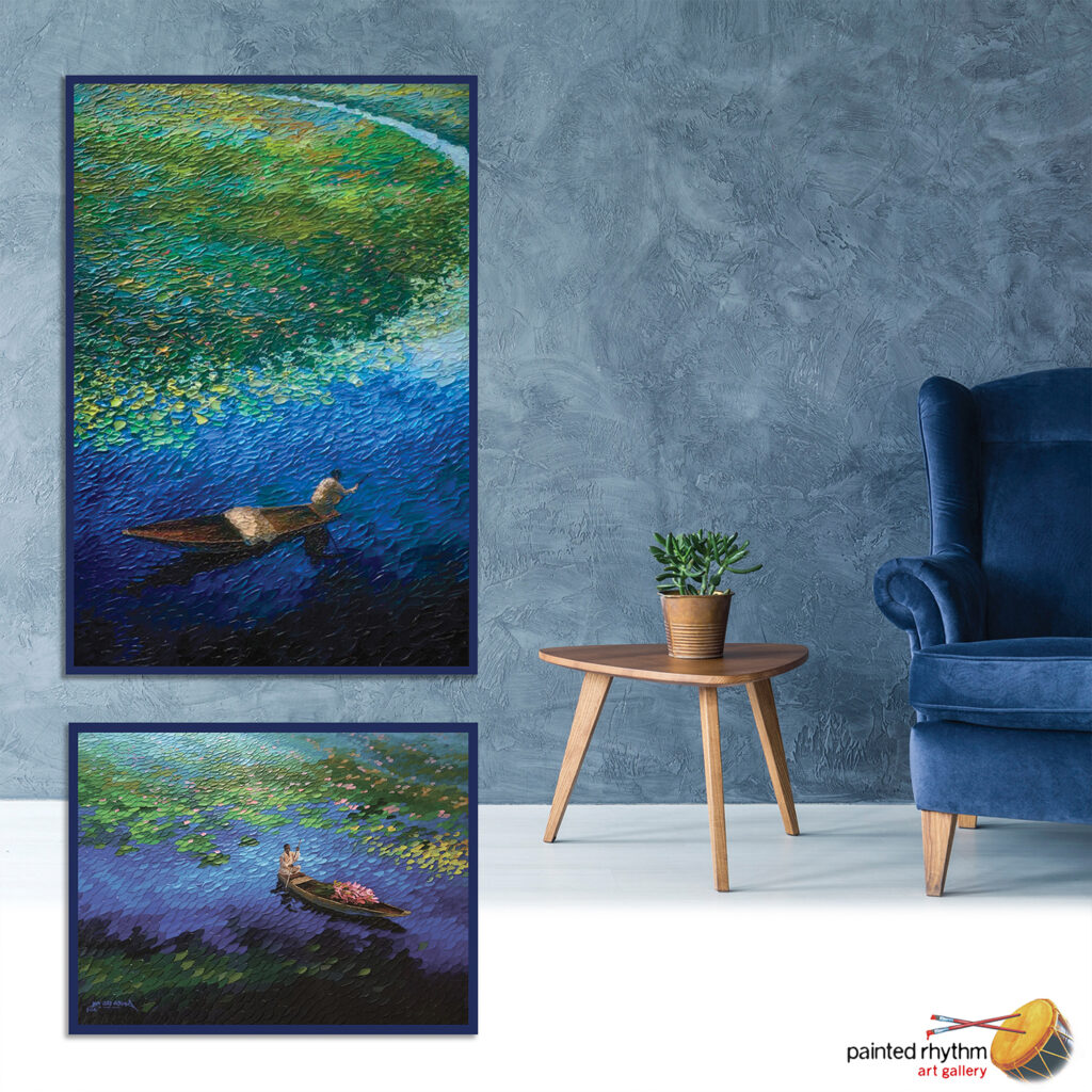

BLUE
Blue is for calm, trust and intelligence
Blue symbolizes tranquility. Drawn from nature’s color of calm waters and blissful skies, it’s not surprising that soothing and symbolic blue represents trust and harmony. It also holds energy of meaning and conveys a sense of calm, making it popular.
Blue is a serene and calming color that represents intelligence and responsibility. Blue is cool and relaxing. Light baby blue is peaceful, while dark blue can signify depth and power. It is the most popular color in the world, both when it comes to personal preferences (for both genders) and usage in business logos. It’s the go-to color for trusted, corporate institutions, like Intel, Microsoft, IBM, HP, Dell, LinkedIn, Facebook, Twitter, etc.
Blue is often used in offices because research has shown that people are more productive around the color blue.
GREEN
Green is a color of nature, symbolizing health, youth, renewal, good luck, and even money.
Green is universally associated with nature, linked as it is to grass, plants and trees. It also represents growth and renewal, being the color of spring and rebirth. Another association is “getting the green light” to go ahead, giving it an association with taking action. In the US, green (and especially dark green) is also associated with money and so represents prosperity and stability.
Green is for nature, growth and harmony—but also wealth and stability. Green is also often seen as a fourth color on top of the primary red, yellow and blue (think Microsoft and Google), bringing a sense of visual balance and, as a result, a soothing and relaxing influence. Famous brands that use different shades of green include Starbucks, Spotify and Whole Foods Market.
The connection to nature makes green a ‘natural’ choice for a vibe that’s eco-friendly or organic. Shades of green can represent nature and make you feel harmonious. It is a color for all rooms, especially at your vacation homes or farmhouses.

YELLOW
Yellow is for happiness, hope, spontaneity
Yellow is the color of the sun, smiley faces and sunflowers. It’s a happy, youthful color, full of hope and positivity. It’s another color that grabs your attention and for that reason can also be used to signify caution, like red and orange.
The golden arches of McDonald’s (well, they’re yellow, really) are a globally recognized symbol that can be seen from far away and immediately gets associated with fast food. In the same way, Best Buy’s yellow tag indicates a reduced cost for its cost-conscious customers (say that quickly three times!).
Yellow is a great choice if speed, fun and low cost are attributes that you want associated with your brand. Be careful with different shades, though: a bright yellow will grab people’s attention right away and it’s a useful way of highlighting or accenting a design, a pale or warm yellow can look natural and healthy, while a neon yellow can instead be very artificial.
ORANGE
Orange is for creativity, youth and enthusiasm
As a secondary color, orange combines the warmth and heat of red with the playfulness and joy of yellow. It attracts attention without being as daring as red, and is used for warning signs like traffic cones and high-visibility clothing. It’s an energetic color that can bring to mind health and vitality, given its obvious link to oranges and vitamin C. It’s a youthful color as well, bringing an element of vibrancy and fun.
A good example of using orange to connect with a young audience in a fun way is Nickelodeon. To promote energy and activity, Gatorade uses an orange lightning bolt, while orange is also a popular color for tropical drinks like Fanta.
Orange can be a great choice for a youthful and creative atmosphere in your home that wants to be a bit different to the mainstream. It’s a friendly color that also stimulates action so, like red, it can be used as an accent color to catch the eye and promote activity.

RED
Red is for energy, passion and danger
Red is associated with the heat of energy, passion and love. Think of the bold red of a fireman’s truck or the ‘stop’ sign in traffic. Or brands like Netflix and H & M. Red is bold, exciting and youthful. If you have a loud personality and want your interiors to stand out, then red could be the color for you. Deriving from brands like Lego and Nintendo, its high energy makes it a great choice for playful and active rooms in your home such as the living room and games room.
Red is also said to stimulate appetite, which is why it is popular in fast food chains—most famously in McDonald’s, which combines red with another primary color, yellow. Also, brands like Coca-Cola, Red-Bull, Lays, KFC, Heinz and Kellogs. Red artworks can be a good stimulus in the dining rooms.
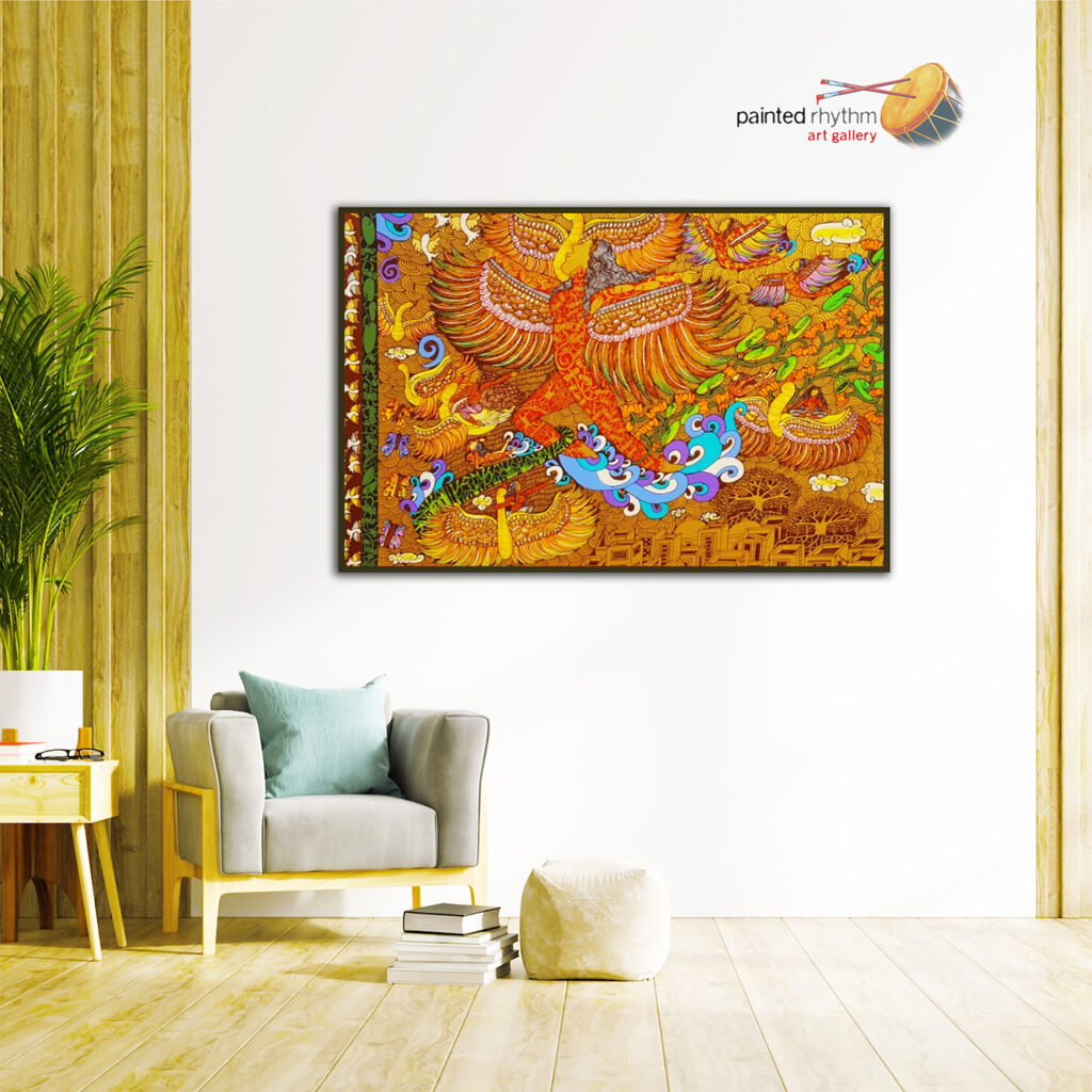
MULTICOLOR
Multicolor is for fun, diversity and optimism
We’ve looked at the meanings of individual colors. So what happens when you bring them all together? What feelings are evoked with multicolored designs? Well, while monochromatic colors can bring focus and style, colorful paintings can show that the ambience is playful, informal and creative. Say, Google uses multiple colors in its logo and interiors to represent the playfulness of the brand.
Why choose one when you can choose them all?! Using many colors appeals to children or a more creative audience. Think about whether you want to use complementary colors to provide a real ‘pop’ (colors that are opposites on the color wheel, for example, purple and orange), analogous colors for greater harmony (colors that sit next to each other, for example, red, orange and yellow) or triadic colors for a more dynamic effect (colors that are evenly spaced around the color wheel). You can read more about these different color combinations in this article on color theory.

BROWN
Brown is for wholesomeness, warmth and honesty
Brown is a natural color, associated with the earth and as a result giving a sense of stability and support. Given its link to the earth and nature, brown brings to mind farming and agriculture and other outdoorsy activities. It’s warm and friendly, practical and dependable, and can also represent the old fashioned and well established.
Brown is a warm, neutral color that you can use to convey warmth and wholesomeness. Use it for an earthy environment and in a natural pairing with green to really capture that organic feel. You can also use brown to give the impression of a well-established heritage and a sense of tradition.
BLACK
Black is for elegance, power and sophistication
Black is an incredibly versatile color and probably the most used color in graphic design. It is bold, powerful and a little mysterious, which makes it a firm favorite of modern times. Depending on the design context, it can be used to create a cool and unapproachable look as well. At the same time, it’s an inherently neutral color that works well in combination with any other color and is often used for typography and other central, grounding design elements.
Luxury brands like Chanel and Dior keep things stylish with an iconic black-and-white logo. Brands like these want to be a little intimidating and unapproachable as that makes them more exclusive and aspirational. If you want to convey a sense of luxury, you can’t go wrong with a simple black-and-white color scheme. Combined with a gold, silver or why not a royal purple in an artwork, you’ll give your interiors an air of exclusivity and prestige. On the other hand, black can also be used with bright colors for contrast and when combined with other powerful colors like red or orange it can be extremely impactful and thrilling.
WHITE
White is for minimalism and simplicity
If you know your science, then you’ll know that white light actually contains all the colors of the rainbow—but to the naked eye at least, white is the opposite: it’s the absence of any color. In Western cultures it’s often associated with virginity (think of brides wearing white on their wedding day as a symbol of purity), while in some East Asian countries it’s the color of mourning. When used in design, white creates a minimalist aesthetic. It can be very simple, clean and modern. It’s also the most neutral color of all and can be quite non-descript as a base for other, more exciting colors.
White space can be as important in a design as all the other creative elements. It’s also often used as a secondary accent in a color scheme. Together with pastels, it can bring to mind spring and femininity; combined with simple black it becomes classic and minimalistic, just like the Apple or Nike logo. When it comes to white, it’s a lot about the colors you put it with.
Conclusion
So there you go, an epic journey through colors and emotions.
Of course, it’s not an exact science. People may have personal preferences that override any deeper biological tendencies, cultures vary in their interpretations and there may be other things you want to take into consideration as well.
Now that you know the rules, you can play around with them and see what works for you. Feel free to break them, too, you crazy rebel you. Just make sure that you’re doing it on purpose and not choosing crazy color combinations without any consideration of what effect they might have.
