HOW TO CHOOSE A FRAME
Choosing a beautiful artwork is the hard part of selecting and purchasing art until you have to frame it. Framing isn’t just about hanging your artwork and pictures; a frame helps to anchor a painting or a picture in your space and tie it into a room’s decor. A quick trip to a frame store to pick a frame can leave you instantly overwhelmed. There are so many colors, styles, and sizes of frames available to choose from. The right or wrong picture frame can completely change the artwork and how it works within your space.
Sometimes the artwork comes framed, and in these situations, you’re in luck. When a painting comes framed, it means the artist or the gallery chose the frame to complement their art and display it as they have intended. If your artwork comes framed, then it’s usually a good idea to keep the original frame.
But what about unframed artwork? How do you know which frame to choose and what will suit both the painting and your decor? There are so many elements you will need to consider when selecting a frame. We hope this article helps you find the perfect frame for your piece of art. While personal taste and subjectivity do play a role in the framing choices that you make, here are a few basic considerations before you get started –
Components of Framing
Material
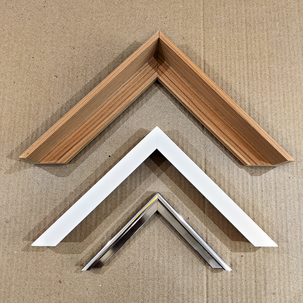
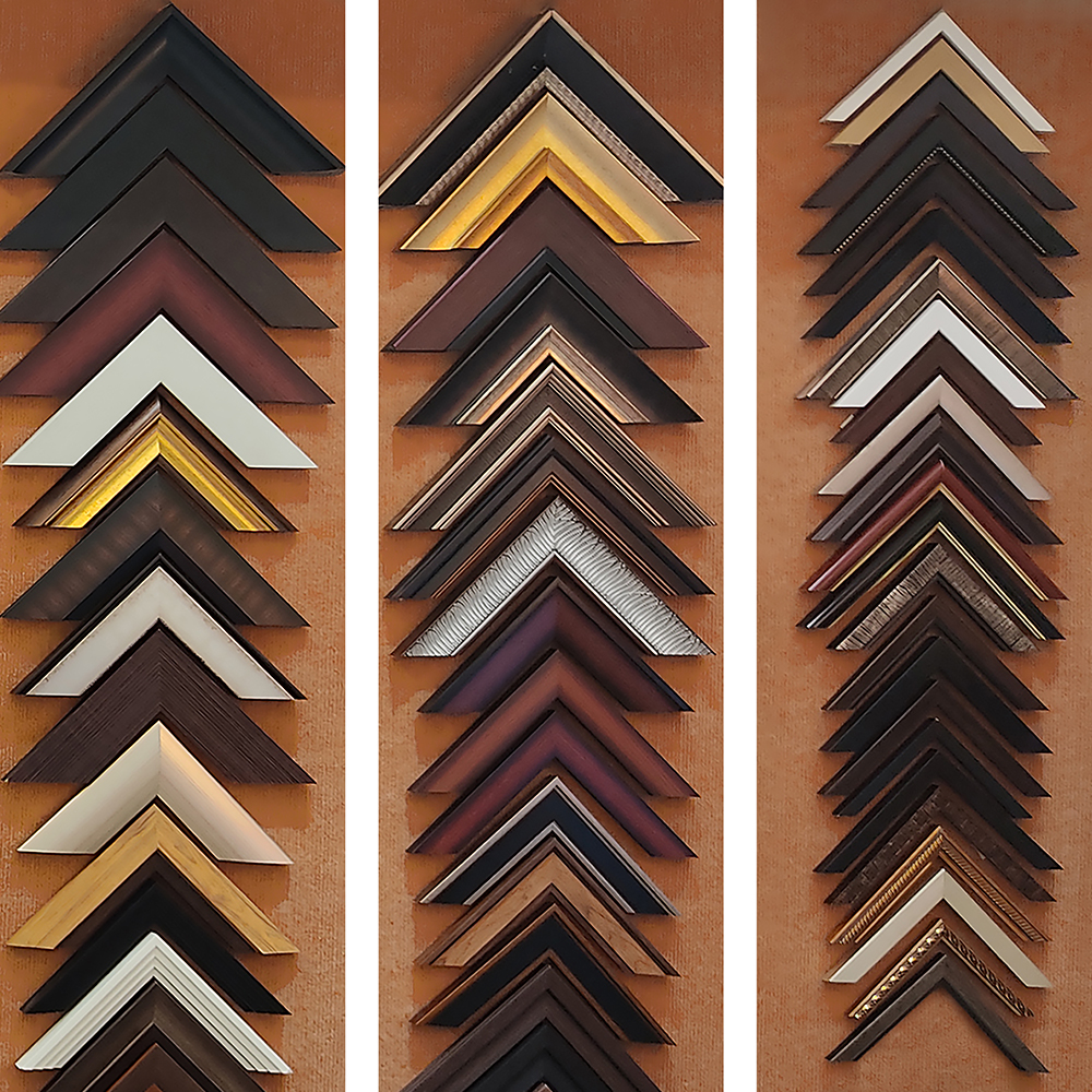
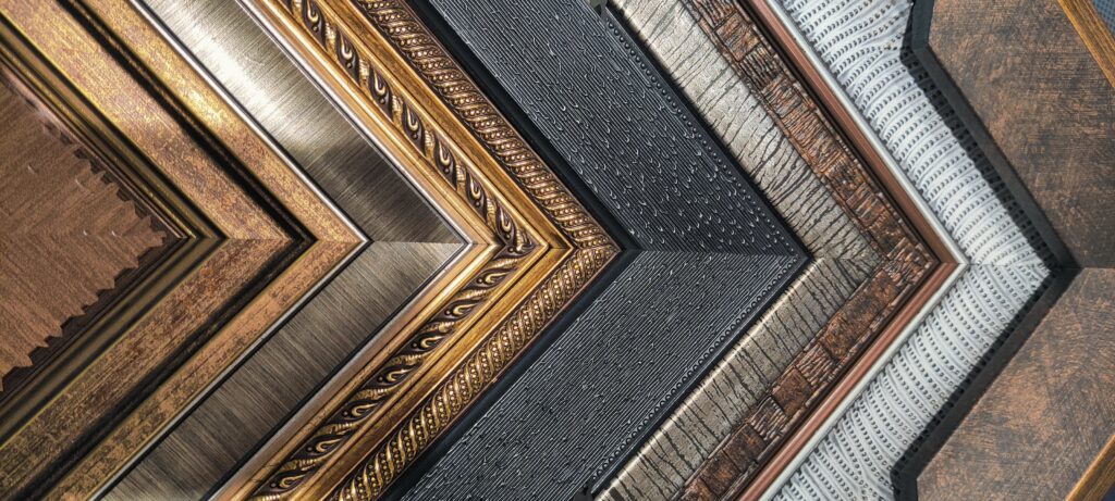
Frames can come in various materials, but the most common are wood, metal or plastic. Each material has its own variances, with different color prints, finishes and styles.
Metal frames can vary from gold, bronze, silver, copper, or tarnished versions or any of these. Woods have endless variations in both type and finish; wood types range from bamboo to oak or pine, and everything in-between. They can be polished, painted, varnished, stained, or unstained. Plastics and glass also come in many different colors and finishes, from matte to glossy.
Thickness
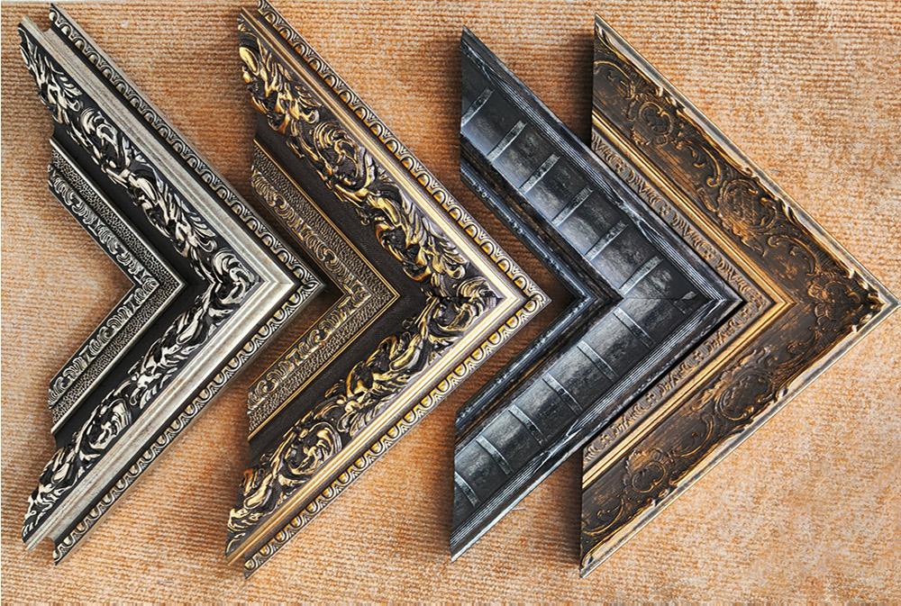
Thickness of the frame is another important consideration. Antique frames tend to be wide, heavy and ornate. They are as beautiful to look at as the picture they frame.
But modern and contemporary frames are typically thinner. They usually let the artwork take centre stage and don’t try to steal the limelight.
Decoration
Frames are often either square or rectangular, but they can also be decorative. A decorative frame can be ornate and even three-dimensional. Decorative frames can come in shapes, colors, textures, and materials. In contemporary interior styles, decorative frames are less common for larger paintings and more likely to be used as photo frames.
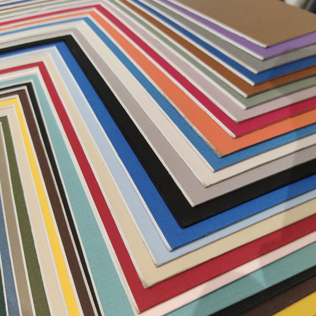
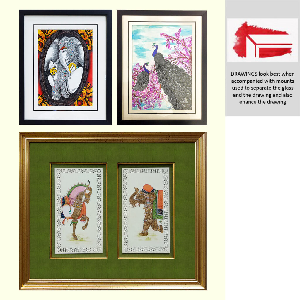
Mount
A mount is an additional thin strip of paper or material which serves as additional decoration and creates a space between the artwork and frame. This framing feature may also be known as a matte or mat. A mount can fill the gap between a larger frame and a smaller picture, allowing smaller paintings to fill larger spaces.
A mount also allows you to choose a brighter or more ornate frame without it overwhelming the artwork. We have different techniques and styles of mounting which could be single, double or triple mounts or a combination of mounts of various thicknesses. They come in various textures and fabrics. But, that said, not all frames require a mount; some frames sit right on the edge of the painting.
Prints and Patterns
Prints and patterns are less common on contemporary frames than they once were. Before the modernist era, frames were ornate and as carefully created as the artwork itself. Frames could be painted or carved with intricate prints and patterns. While these decorative styles are less common in contemporary galleries, the juxtaposition between an ornate patterned frame and a modern piece of art can create a nice visual tension.
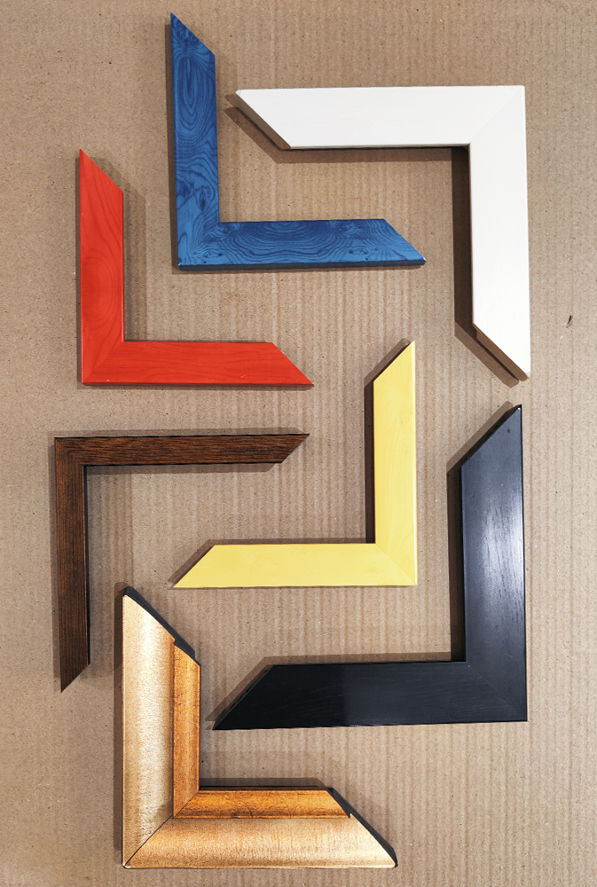
Color
Frames come in every color imaginable. However, some of the most popular frame colors are neutrals such as white, black, cream, or grey. Unpainted wood or gold and silver metal frames are also popular choices. Choosing a color is as important as choosing the material it is in. Say, a yellow-stained wood frame is very different from a yellow plastic frame. And while a thin rust gold frame may be chic and contemporary, a wide, heavy rust gold frame is more old-fashioned.
Neutrals are a safe and easy choice, but that doesn’t mean you can’t choose a bold color like red, pink, orange, or green if the artwork and room call for it. If you are concerned it will distract from the artwork; then a mount can create a visual separation between the two.
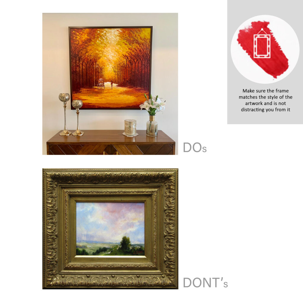
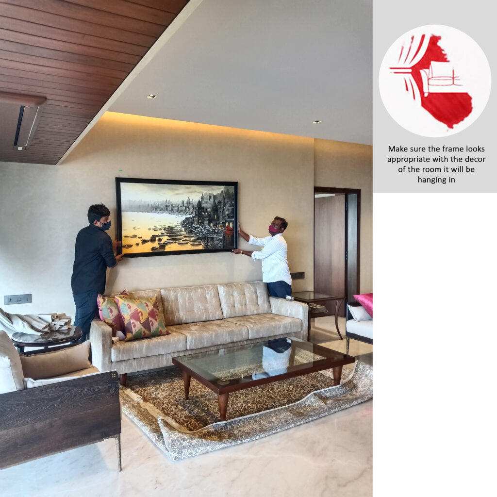
You shouldn’t be too concerned about matching specific colors in your artwork to the frame color. Instead, it’s more important to consider the overall tone of the image when selecting a frame. You can also consider your existing room decor and how a frame matches or compliments the overall style. Sometimes, it’s more important to match the frame to the room than to match a color in your artwork to the frame itself. A frame can help tie artwork into the style of a room. For example, if you’ve chosen a bold piece that contrasts with the decor style, then a frame can be a bridge between two different aesthetics.
But, if you decide to match your frame to colors in the painting, you should choose an accent color or tone that isn’t the most dominant or obvious color. This strategy helps to prevent the frame from blending in with the artwork too much.
Consider the overall tone of the painting when choosing a frame. Lighter frame colors often work well for more casual pieces, while darker frames add a feeling of formality. To help your artwork stand out, choose a frame color that’s different from your wall color. You should also select a different color for the frame and the mount. If these are too similar, they draw attention to the framing instead of the artwork.
Metallic frames create a more luxurious and glam look. Metallic frames in silver, gold, or rose gold are popular choices for modern art such as prints and art photographs.
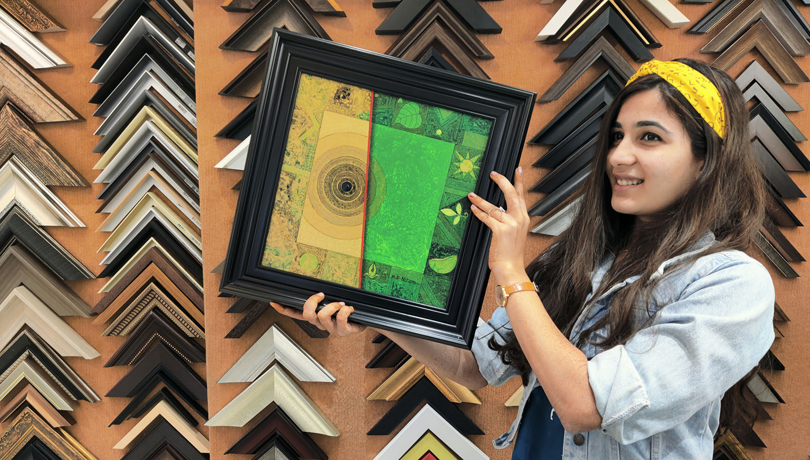
Painted Rhythm often frames artworks simply using natural wood frames or monochromatic frames that are either black or white. This style of framing allows the artwork to catch the eye without distraction from the frame.
Glass
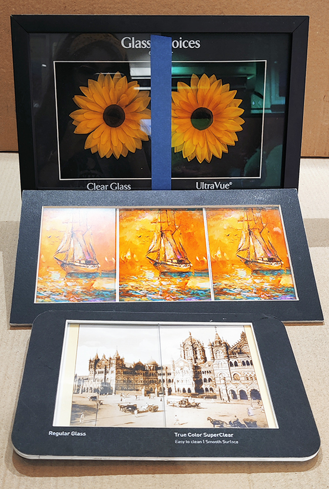
When putting pictures and artworks behind glass, that’s another decision to make because there are various types of glasses with different price ranges and clarity.
Plain old picture glass is fine for most purposes and the cheapest option. Picture glass is typically, only about 2mm, or about 1/16th thick and although surprisingly resilient, isn’t inclined to flex too much before cracking, if leaned on. So, hang it well out of the way of children, the elderly or vulnerable, or indeed anyone who could fall against it.
You could specify 3mm or 4mm glass or safety glass of course, but this is going to add considerable weight to the whole picture and you need to take advice as to whether the frame and/or any notion of hammering a single nail into the wall to hang it on is up to the job.
Non-reflective glass is great if your painting is opposite a window or other light source that makes it difficult to see it without the light getting in the way. It can, however, dull the image slightly, but it certainly cuts out most of the unwanted reflections.
A really heavy piece of work, especially if it has glass in it, or where it’s on public display, may need several of those brass plates that screw to the wall and the back of the frame, to properly secure it.
The safest but usually the most expensive option is to look at the various types of plastic or acrylic sheet. They’re also a lot lighter than glass so offer reassurance on the safety issue.
They can, however, scratch more easily and if polished with the wrong substances, can frost or fog over and from there, there’s usually no way back other than replacement.
Museum glass is much more non-reflective and usually the most expensive of all three kinds. It provides clarity as good as when kept in the museum and is a little more tough as well so as to protect expensive or exclusive artworks.
Cost
Now we’ve not ignored cost because make no mistake, framing your work can be a fairly expensive process. A decent framer will provide invaluable advice as to frame style, mount, colors and so on, picking up many of the points we’ve outlined. However, framing costs money and if you’re hoping to sell your work at an exhibition, it’s definitely something you need to take into account. That said, it definitely adds gravitas to your art so, it is your personal call. But, if the painting is for yourself, or a gift, then the decision is actually a little easier because you’ll justify the cost of a good frame in your own mind in the same way as any other piece of furniture that you might buy.
Remember the old adage: The quality of a product is remembered long after the cost is forgotten.
Let's Go Framing!
Still not sure if you’ve chosen the right frame for your painting? Here’s a good way to sense-check your framing decision: step back and look at your artwork. The dominant colors in an image should immediately stand out to you. But if the frame is the first thing that catches your eye, then it’s overpowering the artwork. As a final tip, choose a frame that compliments your artwork but doesn’t exactly match.
If you’re looking for more ideas and inspiration on how to frame or display your new artwork, you can explore some of our artists’ work displayed in collectors’ homes in the bespoke framing section or our Instagram page.
Remember that like art, your choice of frame is subjective. If you love it, that’s what matters most. But here are some general preferences :
For Prints and Photographs
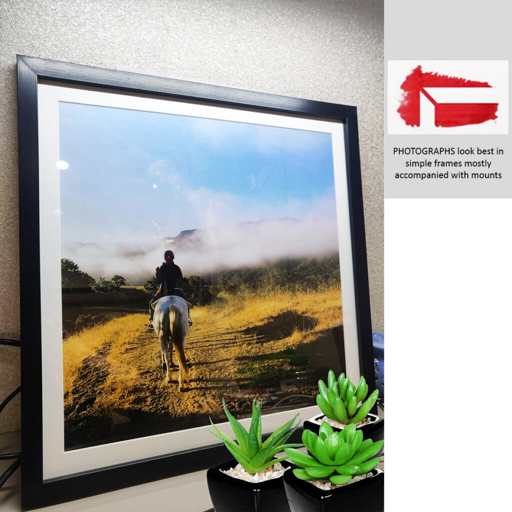
Due to their accessibility and affordability, prints are an incredibly popular medium used to fill up wall space. Consider the spectrum of colours in the print, and choose a colour for the frame that matches that.
All these elements apply to photographs. At first glance, the dominant colours in your photograph should immediately stand out at you. Black or white frames should accompany black and white photographs. Similar to prints, coloured photos should have their dominant colours matched to its frame, allowing the photo to stand out.
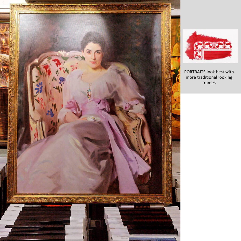
For Oil Painting and Portraits
Oil paintings have been around for centuries, long before people managed to produce glass in large sizes and quantities that could cover the canvas. Oil, unlike acrylic of watercolor, does not dry with water evaporating out of it but rather through oxidation. While a completed oil painting might feel dry to the touch and possibly be safe to handle after a few weeks, it will not be completely dry for decades. The thicker the layer of oil paint on canvas, the more likely it might crack, as the paint is still considered unstable.
The choices in framing an oil painting are endless. Factors to consider are once again to note what the dominant colors are and how a frame can complement the overall composition of the artwork. However, this all comes down to personal preference. Oil paintings allow for more flexibility in choosing bulkier wooden frames, but should also adhere to what the painting evokes, its ‘weight’, and the location that it will be placed in. There are arguments that glass should not be used in the framing of oil paintings as it might trap moisture behind it.
For Drawings and Illustrations
Contemplate the medium in which you’re drawing and illustration works have been made with. Most times, these are made with more organic or perishable mediums such as pastel, graphite or charcoal. Artworks that fall under this category may also be more delicate.
Due to this nature, these artworks look best when framing with a mount, or ‘mat’. Mats do their part in conserving more dainty and fragile artworks over time. Do note in this case that the glass should never touch your artwork directly, and the mat should help separate the two. For example, if a graphite piece finds itself rubbing against the glass, it might cause condensation and damage to the paper; mould and mildew may form. This gap given by the mat gives the artwork an air gap so it can ‘breathe’. This same guideline should apply to all works done on paper.
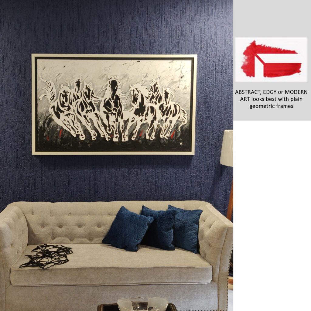
For Modern Art and Mixed Media
Modern art and Mixed media works are amongst the most elusive as they have the capacity to span across all mediums. Take into account entities from all the mediums that have been mentioned so far, and apply it when you decide on what frame to pair it with. In some cases, mixed media works have three-dimensional characteristics to them, and the bulkiness or lightness of frames should be considered alongside this.
Any views or opinions in the post are solely those of the authors and do not necessarily represent the views of the company or contributors.
To Frame or Not to Frame?
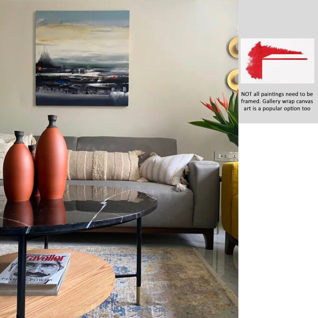
Not all images need framing. It’s becoming more common for artwork, and canvas paintings, in particular, to be left unframed.
Many early 20th century painters disregarded frames completely. This should only apply to paintings on sturdy platforms such as canvases, as it is crucial that works on paper or more perishable mediums are sealed and protected from external factors that might degrade them.
A framer should never be afraid to say when a work does not need a frame. Do make sure that the piece is stretched properly, and that it has the right depth and shape to sit on the wall you are intending for it to go on. Whilst it might require a frame one day to provide it with additional protection, you should trust your taste and how the artwork is presented from a visual point of view. This style of the unframed canvas is called “museum wrap” or “gallery wrap.”
Mixed media artwork or anamorphic art is also often left unframed, especially those artworks which are three-dimensional or have uneven edges.
Conclusion
Well, there are a few things for you to think about and not every frame will involve considering every single one of those factors.
Experience too, is a great tutor and do take time to look in gallery windows, other people’s pictures in their homes and online and you’ll start to get a feel for what works and what doesn’t in your eyes.
Hopefully, what we’ve done is to point you in the direction of some helpful tips and several dos and don’ts, that’ll prevent you from diving in and wasting hard-earned cash, while selecting a frame that will go a long way towards lifting your most recent piece of work into your latest minor masterpiece category!
Painted Rhythm Art Gallery has been providing high quality professional framing services since the past 30 years. Apart from this short guide, our experienced team will happily assist your framing needs. All work is carried out from our factory based in Mumbai wherein industry experienced framers work carefully to make the perfect frame for you. We have over 100 custom mounting and over 500 custom framing options. Contact us at: +91 9821257569 (Ajay Veera) or art@paintedrhythmag.com for more details about the same.
